PURE
PURE
-
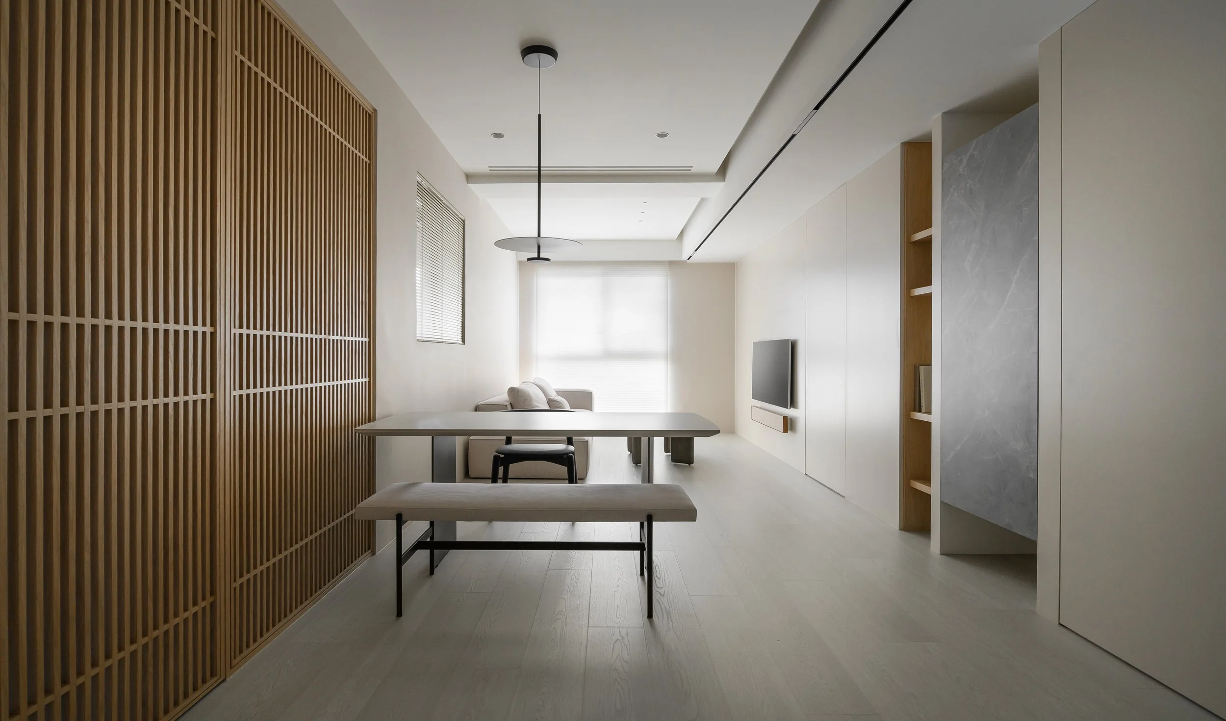
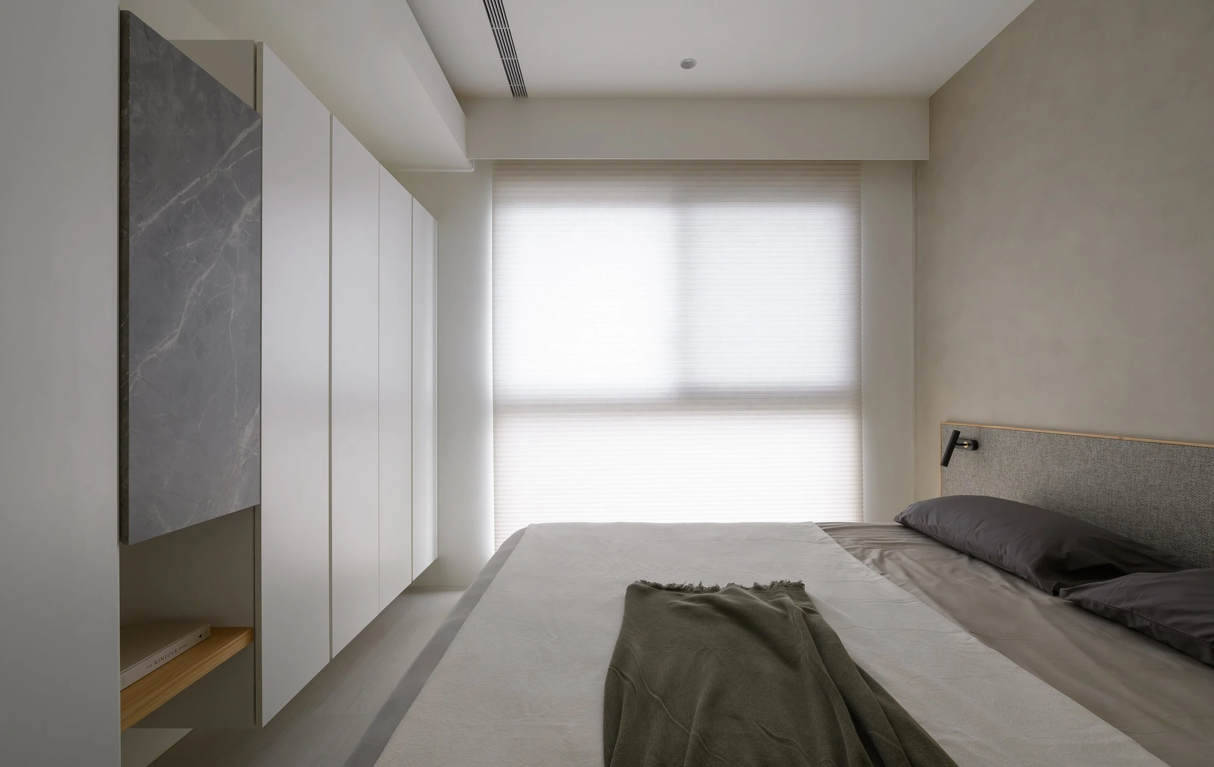
我們將光線最大化的利用,並在空間中選用低彩度且中性的米灰色階作為主要的色彩基調。在配置的選擇上,我們則遵循了「少即是多」的原則,讓室內簡化為最基本的元素勾勒出整體簡潔之氛圍。
選用俐落且線條極簡的家具,在節省空間的同時提供舒適的使用體驗,並利用木格柵的線條延伸,使整個空間更加通透明亮。
空間的布局和流動性是我們最注重的一環,在合理的劃分功能區域時,同時確保整體的一致性和連貫性。無論是在開放式的設計還是分區的安排上,我們都充分的考慮了空間畫面和美學,並將舒適的使用體驗最大化。在追求純粹、自然和平衡的美學的同時,回歸本真。
We make the most of natural light and choose a soft and neutral shade of beige gray as the main color scheme. We follow the "less is more" principle in our selection of furniture, simplifying the interior to its basic elements to create a clean and minimalist atmosphere.We use sleek and minimalistic furniture that saves space and offers a comfortable user experience. The use of wooden lattice lines throughout the space adds openness and brightness.
The layout and flow of the space are crucial to us. We ensure logical division of functional areas while maintaining consistency and coherence in the overall design. Whether it's an open-plan or partitioned arrangement, we consider the visual aesthetics and prioritize a comfortable user experience. We aim for aesthetics that are pure, natural, balanced, and true to the essence.
PURE
INTERIOR PROJECT | 2023Space Type | Residential
Floor Area | 50 m²
Location | Taipei, Taiwan
Photography | MD MOTIVO


